Good design in software is a difficult quality to define. Software that supports the work of clinical trials should be all about getting jobs done efficiently, whether by the clinician, by one of the team managing the study, or by patients. True? If the ‘design’ is good, then the software just works for everyone who uses it. True, yes. But it can do more than merely work.
YPrime has a team dedicated to designing the interface between human and software. The concerns of those people often stray into the realm of working out how to give the software users satisfaction, even pleasure, in carrying out their jobs. Designers try to make their product “desirable,” which feels like an odd thing to pursue in this industry that is rarely associated with life’s pleasant experiences.
Yet desirability is indeed a quality that YPrime tries to capture. If the recording of health data could possibly be a pleasant experience, then it stands to reason that compliance will be better. Patients may even think harder about the responses they give. In this article I shall try to unpack what we mean by the “pleasure” that such a utilitarian piece of software can bring.

Visual Pleasure
We all know what it’s like to get visual pleasure from something. It may not be easy to explain why we get it, but the beauty of nature or art doesn’t need explaining. Something stimulates the brain in a special way, and the brain likes it.
Product designers work on our natural ability to enjoy colour, proportion, texture or spatial harmony, to give their products appeal. We don’t stop appreciating those formal qualities, even when the product is not obviously meant to give pleasure.
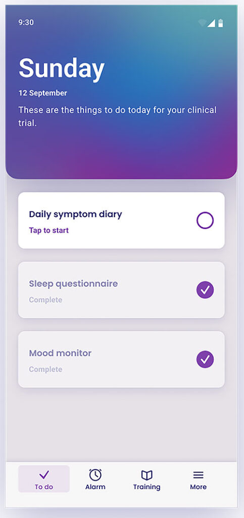
Take the patient-facing menu page illustrated above. It’s not the stuff of dreams. Yet the presence of a changing field of blue and greenish tones is calming, perhaps like an image of the Northern Lights would be. There are no sharp angles – the rounded corners give it an almost tactile attraction. There is symmetry, and we know human minds like that. There is depth, with some surfaces appearing to float above others. There are things demanding attention surrounded by empty spaces that don’t.
The whole impact is one of simplicity, something else that humans tend to appreciate. These effects may not add up to something most people would recognise as “pleasure,” but perhaps they do go as far as being “pleasant.”
Tactile Pleasure
Much of the experience of using an app on one’s mobile phone comes from the motion of the fingers and thumbs. Perhaps it could be described as “kinetic” pleasure. Think of getting a new kitchen installed – a kitchen whose drawers and doors open and close elegantly, decelerating slowly before gently coming to rest. Haven’t we all enjoyed repeatedly opening and closing new kitchen units?
There is something similar in the motions built into a handheld app such as YPrime’s eCOA. Menus scroll up and down, and keep on going when let go. They come to rest with a barely perceptible deceleration. This is how patients experience that menu page too. If they need to scroll, the movement is pleasing. Furthermore, the overall spatial composition changes in response to the user’s touches and swipes – a smooth surface, yet a tactile pleasure.
The Pleasure of Orderly Things
Visual and tactile pleasures are indeed experiences you might expect from items of leisure or culture, but not so much from a ‘medical’ device. What you can expect from a medical device, and any other device designed for practical jobs, is the ability to comprehend a task, figure out how to address it, then get the job done. If that sequence happens with minimal effort, the result is a task successfully executed.
Here, the more familiar skills of a product designer come into play. The designer creates familiar patterns, builds in affordances that help guide the user to the right action, makes natural-feeling sequences that take the user from A to B (whatever A and B mean at any given moment in time), and constructs subtle mechanisms that steer the user back in the right direction, should mistakes occur. The result of a good design is more than just a task successfully executed – it is also a satisfied, happy user.
Feeling Good
In my own years of research into the way people use electronic devices, particularly in the service of clinical trials, I have come across elderly patients who have needed to use a smartphone for the first time. Typically, they not only used the phones but also took pleasure in doing so. A little instruction opens a new set of skills that some people had thought had passed them by. The satisfaction they felt was more than just the pleasure of a job well done. It was the satisfaction of having mastered a new skill. For most patients, smartphones are not novel. Still, the skills of fluently using an eCOA app, and doing so repeatedly for the duration of a clinical trial, does represent a genuine benefit of their participation.
Designers of eCOA apps like YPrime’s tend to make interface controls easy to learn. They can do so by drawing on patterns that the patients have already seen in other apps. In the screenshot above, the depiction of chunks of information in “cards” is one such example. Or they can reduce the effort of learning by placing hints and discreet explanations where they are needed, such as the helper text you can see under the date.
Having established a pattern within an app, designers make sure that details are kept consistent in every other place where the pattern may occur, so that the user never needs to learn it again. In the above example, the drive for consistency goes right down to minute details like the geometry of the card shapes, the style of capitalisation in the text, the velocity with which items scroll away… and many more consistent properties even in one simple page.
A job well done, a task learned and mastered, give patients a chance to feel good about themselves. This is the most satisfying pleasure of all.
It doesn’t end there either. There is also a simple pleasure to be had in feeling that one’s efforts have been noticed and appreciated. Gushing feedback from a commercial product can look insincere if over-done, but a measured amount of vocalised appreciation goes a long way towards keeping the user’s experience one of pleasure rather than boredom. After a run of perfectly compliant days contributing personal data, an unexpected “Thank you” from the app to the patient-user has a measurably positive effect. The purple tick icon in the image above not only indicates that a task has been completed, it also, in a small but unmistakable voice, says, “Well done!”
It’s Not Art
Forgive me if these arguments sound overstretched for a mere data-gathering tool like an eCOA app. I don’t think these claims are too grand. There are categories of pleasure that designers of tools to support clinical trials would not attempt to create. Anything targeting pleasure through appeal to “taste”, any attempt to add depth by cultural references, intrigue through literary artifice, or joy through the creation of unique or surprising experiences, would not be effective. It would likely work well for a small number of users, but fall flat for the majority. YPrime’s app and other well-designed tools of the genre are closer to finely crafted hand-tools, than to beautiful paintings. They can nevertheless reward a patient for their time and attention with visual and tactile gratification, and with a moment of feeling good about oneself.
Check Out Other Patient-Focused Resources
to learn more about YPrime’s commitment to patient engagement in clinical trials.


